Mocha Mousse: Integrating the Pantone Color 2025 into Your Interior
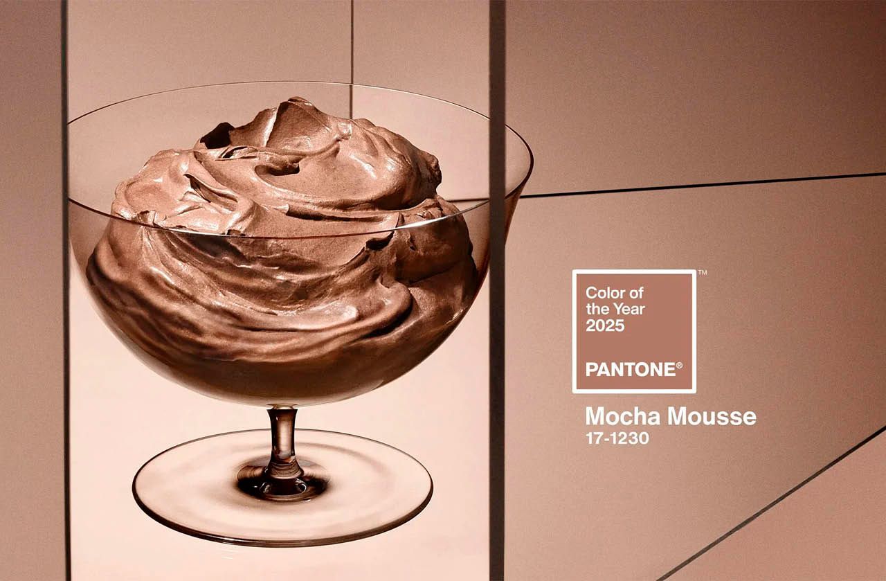
The Pantone Color of the Year 2025 has been revealed: Mocha Mousse — a soft, deep brown with elegant coffee undertones. Rich and cocooning, this hue reflects a renewed need for calm, rooted aesthetics and understated sophistication.
But how can we incorporate it in a timeless, curated way? This guide explores refined and practical ways to use Mocha Mousse throughout your home — with expert advice tailored to this 2025 color trend.
Why the Pantone Color 2025 resonates right now
A response to today’s emotional landscape
Interior design continues to reflect a broader desire for comfort, natural balance, and emotional grounding. Mocha Mousse speaks to those needs, conjuring images of:
A quiet morning coffee
Worn-in leather chairs
Raw earth and slow living
Soft, ambient lighting at dusk
It’s a color of subtle luxury, rooted in nature but elevated through texture and context.
A versatile, shape-shifting hue
What makes Mocha Mousse so appealing is its adaptability. In different lighting, it transforms: richer under warm light, cooler and more matte under neutral tones. It can be:
The base of an earthy color scheme
An accent wall for added depth
A modern alternative to classic gray
How to use Mocha Mousse throughout your home
In the living room: a warm expression of the Pantone Color 2025
Mocha Mousse brings depth and calm to any lounge space. Try it as a statement wall behind a neutral sofa or as part of a layered palette through large-scale textiles like rugs, velvet curtains, or a sculptural armchair.

Pair with warm neutrals like ivory, sand, and ecru, and complement with natural woods and muted metallics (brushed brass or aged bronze).
In the bedroom: Mocha Mousse for softness and intimacy
Used behind the headboard or on linen-textured bedding, Mocha Mousse fosters a cozy, serene atmosphere. This works beautifully when combined with natural materials like washed linen, woven wool throws, and understated ceramics.
A pendant lamp with a soft glow and natural fiber shades completes the look — perfect for evening wind-down rituals.
In the kitchen: when the 2025 color trend meets functionality
The kitchen is no longer just utilitarian — it’s a canvas for tactile elegance. Mocha Mousse works wonderfully on cabinet fronts, particularly with matte finishes and minimalist handles.

Complete the look with light quartz countertops, open wooden shelving, and soft ambient lighting to add refined depth without heaviness.
Get in touch
[FORM]
In the bathroom: turning minimalism into warmth
Even the bathroom benefits from the emotional richness of the Pantone Color 2025. Whether through textured wall tiles, vanity units, or details like open shelving or ceramic accents, Mocha Mousse adds warmth to a space that’s often overlooked.
Use it with stoneware, travertine, or brushed brass fixtures for a spa-like feel.
In transitional spaces: visual rhythm and cohesion
Hallways, entryways, and stairwells are the perfect spots to create visual continuity using Mocha Mousse. Whether applied to full walls or partial sections, it enhances spatial flow while establishing a calming rhythm.
What colors and materials pair well with Mocha Mousse?
Earthy elegance: a grounded, organic palette
Mocha Mousse plays well with a wide range of hues:
Terracotta, burnt sienna, ochre
Olive, sage, eucalyptus
Ivory, warm beige, bone
Natural wood tones (oak, walnut)
These combinations evoke natural depth with understated elegance.
Textural contrasts: letting the Pantone Color 2025 shine
Using contrast and layering is key to successful application:
Combine matte walls with glossy finishes
Add handwoven or stone-textured accessories
Balance dark accents with soft, curved shapes
Mix Mocha Mousse with glass, cane, and ceramic for added dimension
Common mistakes to avoid with Mocha Mousse
Even the most beautiful color can fall flat if misapplied. Here’s what to avoid:
Pairing Mocha Mousse with overly cold tones like steel gray or icy blue without intentional contrast
Overloading the space with dark furniture or finishes — this color needs visual breathing room
Using it under harsh, overhead lighting — this hue thrives in soft, directional or natural light
Why you should consult a designer when using the Pantone Color 2025
Translating a color trend into your space isn’t just about aesthetics — it’s about atmosphere, proportion, and light. A designer helps you:
Understand how Mocha Mousse reacts to light in your home
Build a harmonious palette tailored to your lifestyle
Choose materials that enhance the warmth and depth of the tone
Avoid common design pitfalls that flatten the effect
Ready to refresh your space with the Pantone Color of the Year?
At RK Interiors, we help clients bring depth, elegance, and timelessness to their interiors — using color as a guiding thread.
Mocha Mousse isn’t just a trend. It’s an invitation to reconnect with the spaces you live in.
Book a color consultation or full redesign today.
